— Mixt —
The Way to Salad
MIXT wanted a brand identity as fresh as the salads they sell. As massive fans—particularly of the Beetnik with roasted golden beets, savory herbs, and balsamic vinaigrette—we were happy to deliver.

MIXT is the OG of salad joints. It was founded in San Francisco in 2006 when salad was thought of as a side, not as a “real meal”. And it hit big, now boasting 18 locations.
Pre-pandemic, you’d see MIXT fanatics lined up around the block. But radically reduced downtown street traffic—and several copycat salad competitors—took their toll.
It was time to put some new dressing on a great salad. It was time for a rebrand.
- Branding
- Identity Design
- Photography Library
- Communication Design

Instead of shooting bespoke, stylized images that have limited use, we found a more flexible way to capture imagery. We created a new system to photograph individual food items and ingredients—out of which any arrangement could be built, from simple to elaborate.

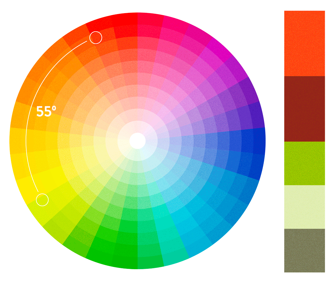
In addition to establishing new brand colors, MIXT wanted a way to create custom palettes for various seasons and future campaigns. So we invented a simple system for that purpose. With the MIXT color wheel, you start with an initial “hero” color and then source a secondary color by turning the color wheel 55º and mixing that shade with one of the brand colors. The result? A new and unique 5-color palette for any season or campaign.
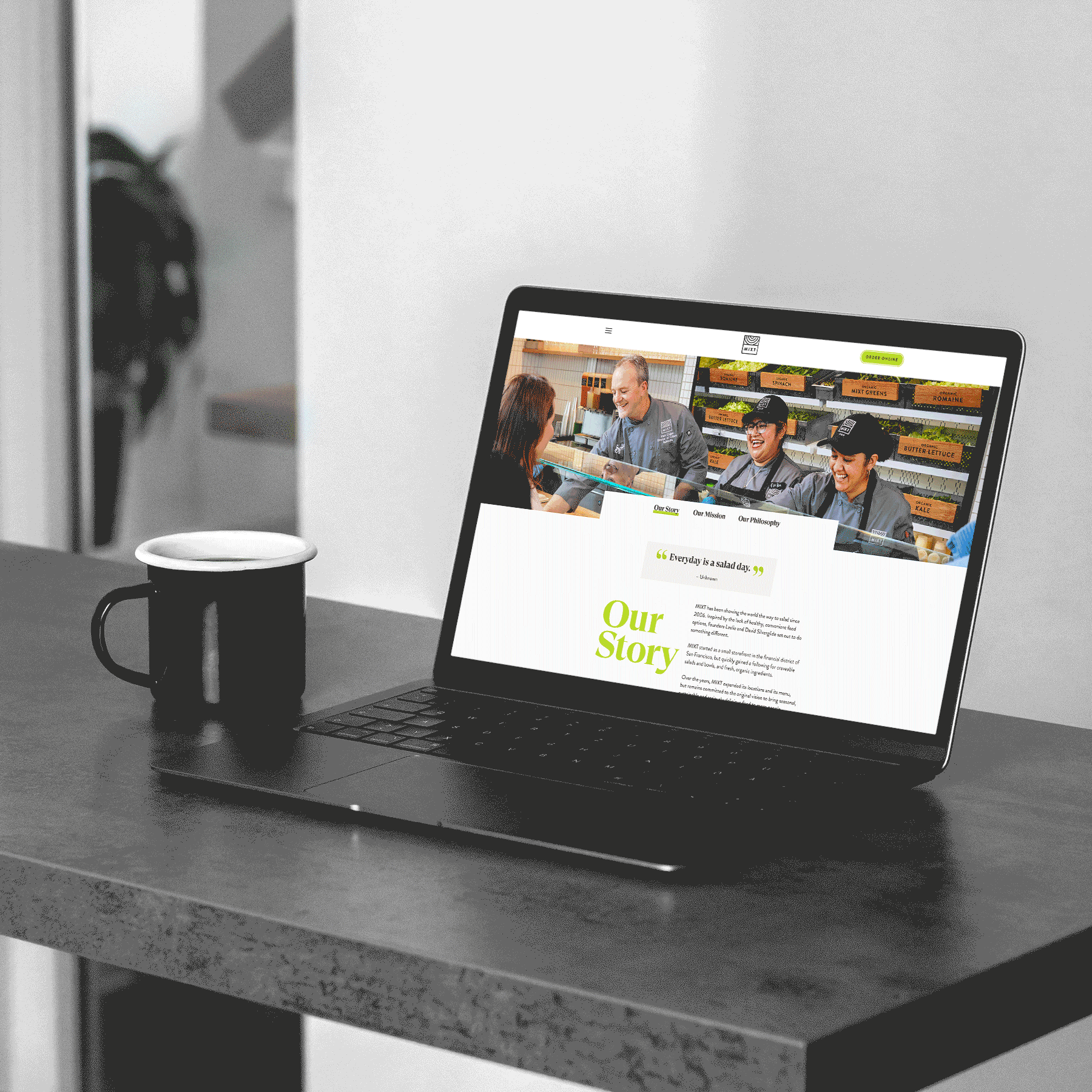
Style and simplicity is the best way to describe MIXT typography. We used GT Super Display as our main headline typeface and paired it with an existing secondary font from their logotype. Referencing expressive serifs from the 1970s and 80s, it gave the MIXT work an instant refresh that was both nostalgic and contemporary at the same time.


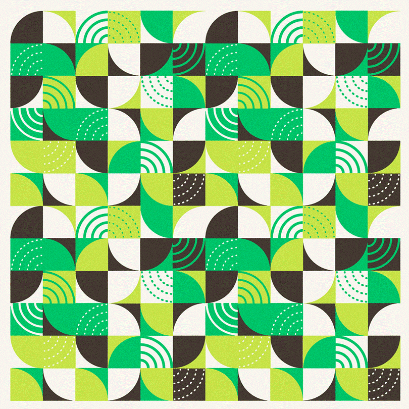
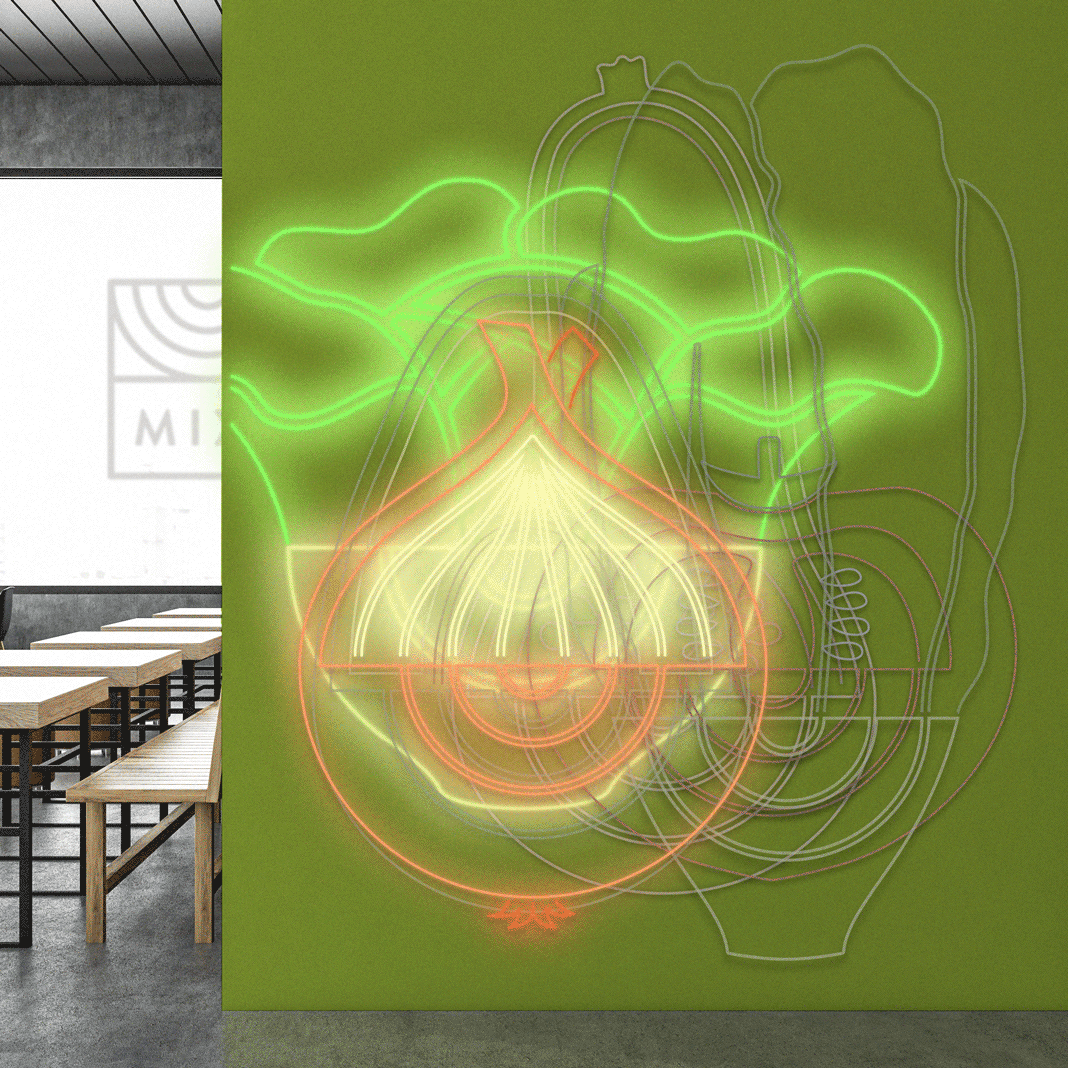
We also created a set of custom patterns by deconstructing the bowl in the MIXT logo. These patterns are as flexible as the color palette and can be rebuilt for any season and any campaign.